Logo Design Process for SisterCodes Podcast
Hi everyone! I’ve been working on a secret project with my sister Kaylee @justacoderthing and I am super excited to announce that we are starting a podcast 🎤 called sistercodes! 🥳 You can currently follow us on Spotify and we’ll be on Apple Podcasts soon. Our first episode on covid, new jobs, and work-life balance is on Spotify now!
Sistercodes is a podcast hosted by Ashley and Kaylee - we're sisters who talk about our journeys in tech. We're excited to share our experiences working in technology in two different countries and get real with what it's really like being a minority in one of the fastest growing industries in the world!
In this blog post I’ll be showing you how I designed the logo for our podcast sistercodes from scratch using Adobe Illustrator! 🎨🖥️
To start off, I knew that I wanted the logo to have our faces, the title of the podcast, and our names. I created a face outline with a combination of eclipses, the curvature, and shape builder tools. I have wavy hair so I wanted to convey that by adding little wisps. It turned out slightly cartoon-like which my sister and I agreed was cute but she suggested I try making a vector image from photos of the both of us.
I started with a photo of myself and using the curvature tool I traced my approximate hair and face shape 👩🏻. After that I picked a hair color, skin color, and lip color, and kept making adjustments until I liked it! I went through several iterations of highlight colors before settling on the simple highlights version since I think it looks the best.
Ashley graphic version 1
Ashley graphic v2, v3, v4: Simple, medium, and heavy highlights
Next, I designed my sister’s graphic using the same vectorization process. I created a timelapse of this process which you can see on my Instagram in the video below. I ended up with these two vector images of our faces. My sister has very curly hair 👩🏻🦱 so it took more time to outline her graphic using the curvature tool but I’m very happy with how it turned out! I went through a few different iterations of hair and skin colors before landing on these - I think they’re a fairly accurate reflection of what we really look like.
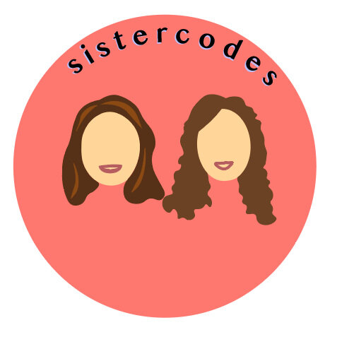
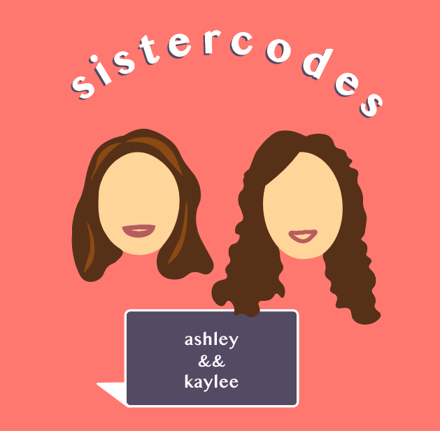
Next, I created a circle behind the two faces and added the title of our podcast “sistercodes” to the top using the type on a path tool. I copied the text and then overlayed the two with a slight gap so it looks like the text has a shadow. I went through a few color iterations before deciding on this coral background color! I created the laptop 💻 and added our names to it - at Kaylee’s suggestion I put && instead of & as a nod to the double ampersands in code which I think is a very cute touch 👩🏻💻. I didn’t love the laptop color, so I switched it to a darker purple and changed the text of our names and the podcast title to white since I think it’s slightly easier to read. My sister suggested a last minute change to match our hair colors and I think it perfectly tied up the logo and made it cohesive! Here are the final logos, in circle and square formats:
I am honestly so happy with how this logo turned out - I think it’s a great representation of my sister and me and our podcast! 😊 I have learned so much from my Adobe Illustrator course and really enjoyed applying my knowledge to this project!
I hope you enjoyed this post and it gives you some insight into what it’s like creating a logo from scratch using Adobe Illustrator! If you’re interested in following our podcast sistercodes where Kaylee and I share our career journeys as minority women in tech - please follow us on Spotify below! 😊 Thank you so much for reading! 💙💙


